I’ve been a hobbyist and semi-professional photographer for about 12 years now. As both a photographer and a food person, one of the most depressing things for me to see is a terrible photo of food. We eat with our eyes first, after all, and if a photo of food looks like dog vomit, then it doesn’t matter how good it might taste; you aren’t convincing anyone about anything with a terrible photo.
With the craze of Instagram food accounts at full blare, and with more and more people shooting their food than ever before, I figured this page might help. I get a lot of questions about camera operation from friends and family, both within and outside the food world. Through the years, I have always kept a draft email ready to go for people who ask. I’ve pretty much provided that here for all.
Essentially, this is a tutorial about how to use a camera. As a disclaimer, this is not really geared for cell phone usage (though there is some overlap). I don’t use a cell phone to take photos of food, because they suck unless you have friends holding lights. Afterwards you still have to spend a bunch of time editing to get everything to look right. Sometimes they’re good if you’re dining outside, but otherwise my advice is to avoid them.
The tips below are for people who shoot with a good point and shoot, an entry level dSLR or some other professional-grade camera. Many people who buy these nice cameras have no idea how to really use them, or what the settings even mean. Below is a quick guide on how to use your camera, with some specific tips geared toward shooting food. It’s a Cliff’s Notes of your camera’s user manual.
LIGHT
Light is the most important aspect of photography. The amount of it, the color value to it, and the positioning of the light source all matter tremendously for a good photo.
Amount of Light
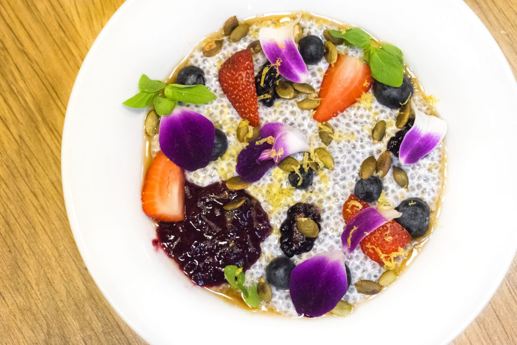
For food photography, you generally want a lot of light so that details can be seen and colors can pop. A good, bright and colorful food photo will actually make someone hungry!
Source of Light
Generally you want to avoid back-lighting or light sources that originate from a direction which casts unsightly shadows across the front or focal point of your subject. Unless you’re going for an artistic silhouette or something with lens flare beaming all over the place, you should get on the other side of the subject.

Practical Tips
The first thing I do when I go to a restaurant when I know I will be shooting photos for the website is to look at the salt shaker. I take note of which way the shadows are trailing. I want to be on the side that gets the most light, not in the shadow.
Shooting in restaurants is not always easy, so don’t get frustrated if at first you don’t succeed. If you must, turn on the flash. But know that using a flash or off-camera light can be intrusive and rude to other diners.
I, personally, don’t use portable lights or flashes for restaurant food photography. Most flashes are hot-shoe mounted or built in, and direct frontal light is not very appealing in photos. They make everything look like a mug shot with a harsh, dark shadow behind. Use your available, natural light if you can.
Off-camera lighting, from up and to the side (“key” light positioning), with a reflector or second fill flash on the other side (to eliminate all shadows), is typically more desirable, but that takes a lot of work that you’re probably not going to do at a restaurant. I do this at home. I may set up a little light box or studio if I am shooting something there, but never at a restaurant where I am casually dining and cataloging for the website.
Color Value of Light
As a general matter, you want to keep your color values as neutral as possible, in order to be true to the look of the food (see White Balance below for more detail on this).
WHITE BALANCE
>The next thing you need to learn about is white balance. White balance is about the warmth or coolness (“temperature”) of the images you are shooting. Unless you are going for a specific effect, the white balance should be neutral so that what your camera captures is true to the environment in which you are shooting, or true to the actual colors and brightness of the object you are shooting. While this may seem somewhat advanced, as it mixes both light and color, I think it is absolutely key to good photography. If you learn it, no – WHEN you learn it – you will improve your photography skills tenfold right off the bat.
Remember that crazy photo that went viral of a blue dress? Or was is gold? The reason it was so ambiguous was because of terrible white balance. When you set the white balance of your camera, you are telling it what colors in the frame are neutral and what should be white. From there, the camera will adjust the color spectrum accordingly, and you should end up with a better, more accurate hue to your images.
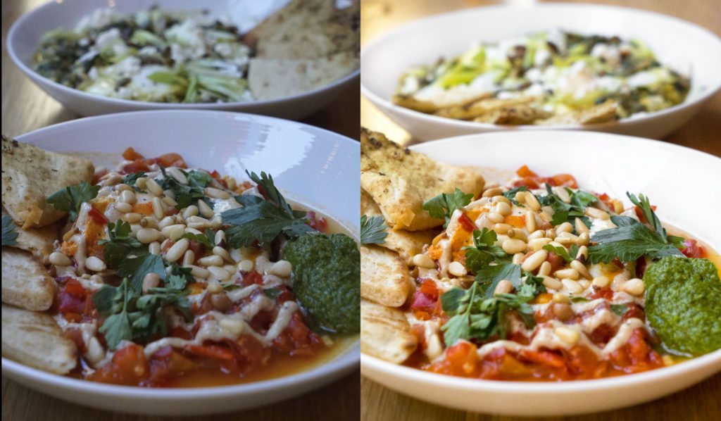
Restaurants are notoriously “warm,” meaning your photos will come out with a yellow, orange or red tint to them if you don’t adjust the white balance, even if you choose “auto.” Auto modes notoriously fuck up the white balance, so a knowledge of some manual tinkering is essential for good food photos.
The second thing I do, after looking at the salt shaker, is to adjust my white balance to meet the “light temperature” conditions of the lighting within the restaurant. Temperature values can range from 2000 to 50000, with 2000 being the most blue or cool, and 50000 being the most warm or yellow. This is different from tint, which varies on a scale from green to purple.
How do you adjust the white balance? Well you can typically choose from a pre-set value setting in the camera’s menu or settings, or you can sometimes do a custom white balance, depending on which camera you have.
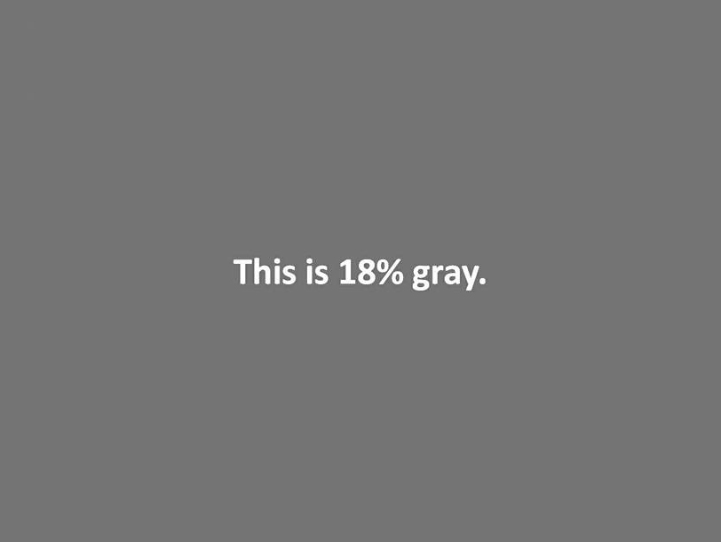
Presets are often made to account for shooting conditions like “cloudy,” “fluorescent,” or “sunlight.” These shift the white balance accordingly, but they are set at a specific number value, in most cases. The best thing you can do is use a custom white balance. Most cameras have this function. Essentially, it means you are telling the camera what a neutral grey is by taking a picture of something that is neutral grey, and from that information the camera will adjust itself accordingly. To do this, I use a white balance card, or an 18% grey card. It fits in my wallet so it’s easy to carry around with me wherever I go.
BASIC SETTINGS
The third thing I do, right after setting the white balance, is fiddle with my settings and take a test shot to see how the images look. This section is the bulk of how your camera actually operates, and nothing has really changed here for centuries.
Shutter Speed
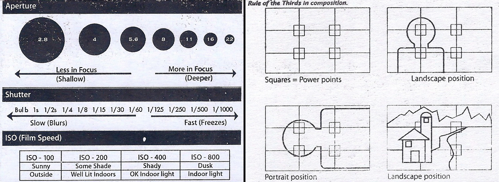
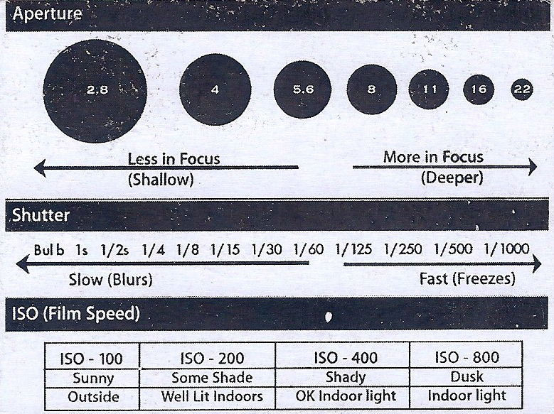
Shutter speed is a measure in time of how long it takes for the camera to open the shutter, expose the sensor/film to the light, and then close, completing the photograph. So 1/200th of a second, 1/25th of a second, 1/2 a second, 2 seconds (2″), 15 seconds (15″), 30 seconds (30″), etc.
Generally when shooting food, I want a fast shutter speed so that there is no blur from camera shake. But be careful; in some fluorescent lighting, a fast shutter speed may result in strange color banding on your photos. Terrible. Sometimes you can even see your viewfinder flickering like an old tube television when this happens. A good rule of thumb is to be at about 1/100th of a second for shutter speed. That should eliminate most camera shake, unless you’re Michael J Fox while off his meds, or you’re on a serious caffeine tear. It will also steer you clear of most fluorescent lighting problems. If you happen to still get fluorescent banding, go down to 1/80 and keep your fucking hands steady when you shoot. Now, to be sure, these speeds are generally pretty slow in the grand scheme of photography. To compare, when you shoot outside in daylight, your speeds may be at about 1/1000 of a second. And most cameras will give you a warning to hold still to avoid camera shake at anything 1/125 and slower.
Sometimes, though, you may WANT a little blur, like if you want to take a picture of a waterfall and have the photo give the feeling of motion, or if you shoot traffic at night and want the car lights to be blurred with motion like they are moving fast. On the flip side, you may want to FREEZE the action, like in sports photography or if you want to capture the details of someone splashing in a pool. Faster shutter speeds will freeze the action with no blur, and you will see little globs of water drops frozen in mid air with no blur.

Aperture
Aperture is how wide the shutter opens during the taking of a photo. The wider it opens, the less will be in focus. This is referred to as “depth of field” in the photography world. For most food photos, you want a larger depth of field, so that all of the food can be seen without losing focus. For example, if you’re shooting a hot dog from one end with a low aperture of, say, f/2.8, then the tip of the dog will be in focus, but the opposite end will not be in focus.

The good thing is that this will generally result in you being able to use a faster shutter speed, since aperture and shutter speed are inversely proportional: meaning that as shutter speed increases, generally you need to open up or decrease the aperture in order to allow the same amount of light to hit the sensor.
In order to achieve those shutter speeds I noted above, you may need to open up your aperture – especially if you’re in a dim restaurant. A word of caution, though, do not open the aperture too wide so that only a little sliver of the food is in focus (like the hot dog example). With food, you usually want to get a good amount of it in focus. I try to be at around f/6.3 and up, with an ideal being at f/8 or f/9, that way all the important bits stay in focus. Try not to go lower than f/5.6 unless you are going for a specific effect or style of image.
Sometimes, for artistic reasons, you may want your aperture lower than f/5.6. For example, in portrait photography, the backgrounds of photos are often nice and blurry. An appealing blur in the background is called bokeh. On some cameras, you can actually see the shape of the aperture opening that is made by the diaphragm blades. Here, you can see 8-sided polygon bokeh blurs that were made by one of my lenses when I shot this Christmas ornament with the Christmas tree lights on in the background, out of focus. Generally, better lenses tend to have more diagram blades (7 or more these days), and they are often rounded blades, that way the polygon blurs are more like circles than geometric shapes.

Photos can end up looking very artistic and the blur causes the viewers attention to be focused on a particular spot. That is usually done with a wide aperture, meaning a larger hole, which means a lower “f-stop” number like f/3.5, and then zoomed in to make the background separate even more drastically.

ISO
ISO is the camera’s sensitivity to light. Higher numbers means higher sensitivity. Each time you increase the ISO by an increment, you increase the sensor’s sensitivity to light by 2x, doubling the exposure. Think of this sensitivity measure like people. A sensitive person will pick up on things better, emotionally. But if they’re too sensitive, then they break down and cry like pussies. The same thing happens with camera sensors. You want the sensor to be sensitive to light, but if it is too sensitive, then the resulting images will break down and lose quality.
I’ve found that Sony offers some of the best camera sensors on the market when it comes to low-light shooting. You can crank up the sensitivity really high and the pictures won’t break down. This is great for shooting in low light, dim restaurants. And by increasing the ISO, you can achieve better apertures and shutter speeds for shooting food, as you are allowing more light to reach the sensor.
Most cameras produce images that have lots of grain when shooting in low light situations at high ISOs (upwards of 3200 or 6400). You also lose detail when that happens. Not good. Even Sony’s entry level cameras are better than some of the top line cameras from competitors in terms of eliminating image noise and grain. But even if a new camera isn’t on the horizon for you, you can still probably bump up the ISO to about 3200 if need be. With my Sony, I can go to 12800 or 16000 without any huge concerns on image quality.
Generally I would just stick to these ISO guidelines unless you are experimenting:
- 100: outdoors in sunlight
- 200: outdoors with clouds
- 400: outdoors in shade; indoors with good lighting
- 800: indoors with less light; outdoors at night with decent light
- 1600: indoors with poor light; outdoors at night with less light
Anything higher would be for very dark stuff, or if you want to get fast enough shutter speeds because you are limited by the aperture of the lens. I always like to use the lowest ISO I can get away with, so that there is no possibility of image noise. Again, newer cameras are getting much better at removing noise so you may be able to adjust upward with confidence.
COMPOSITION
Okay – now you’re almost ready to take the fucking photo! There are just a few more things to think about while you are framing the image. Why? Because a photo is boring and dull unless it has an interesting composition. This is the difference, essentially, between art and mere documentation. Anyone can snap a plain-ass photo with the proper settings, lighting and white balance. But to make it visually evocative and appealing, a rudimentary knowledge or innate understanding of composition is essential. So here are a few things to think about while shooting.
Background
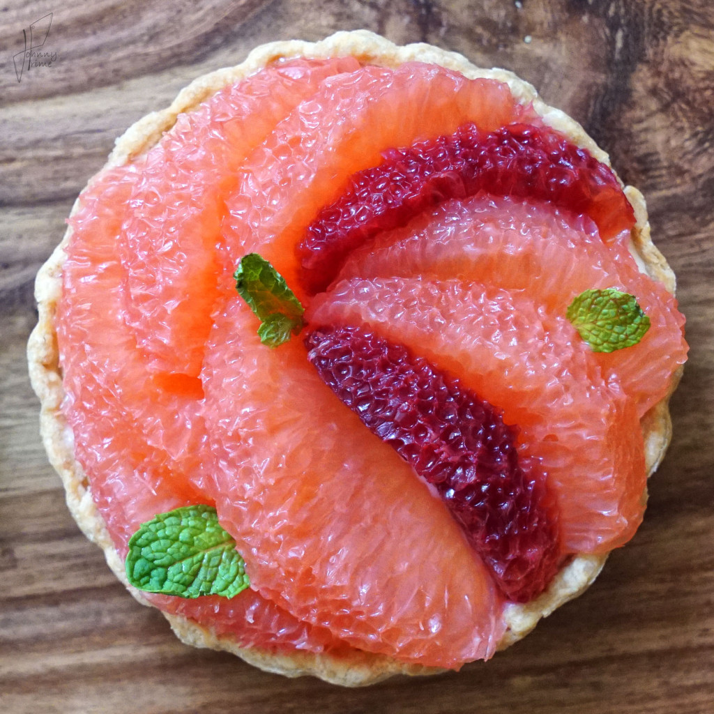
Be mindful of what is behind the subject. Lots of times I see people take pics of their friends and there is a big tree behind one guy’s head, and it looks like his head is sprouting oak. For food, it can be as simple as moving napkins, water glasses and silverware from the frame. Perhaps a decorative place-mat or the wood grain of the table is more appealing as a back drop behind your food.
Viewing Angles
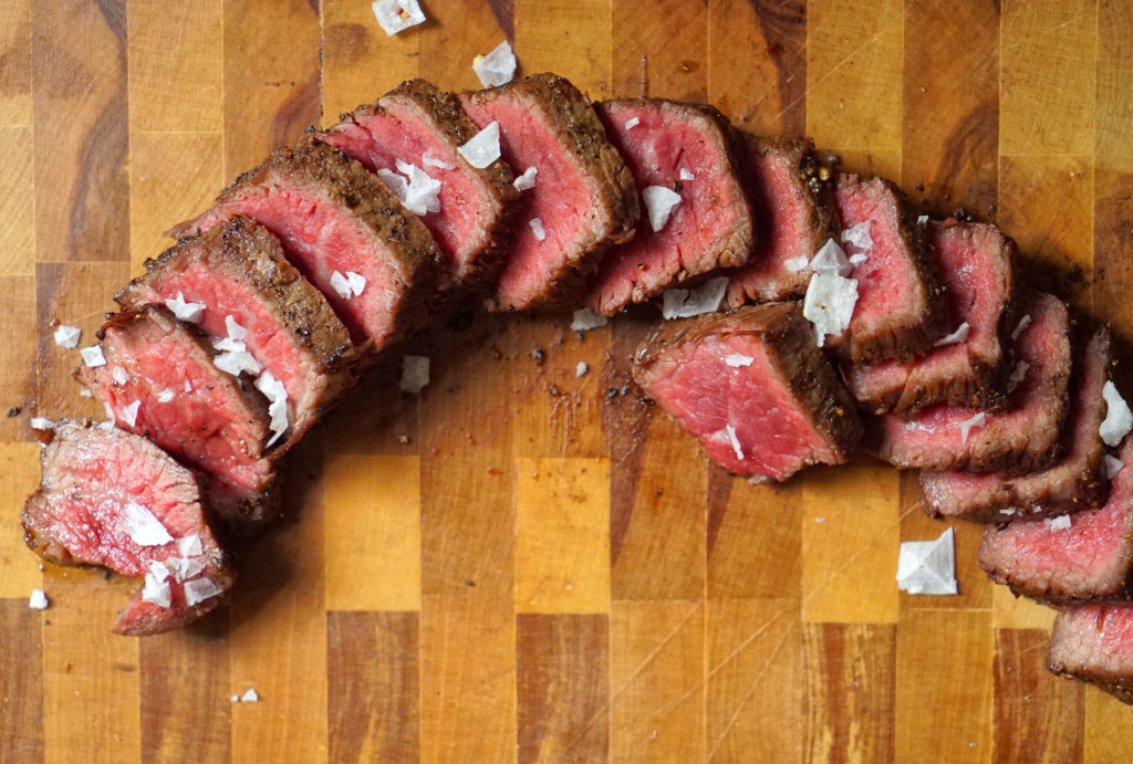
Many food people like the overhead shot. But sometimes I like a low angle better, especially for sandwiches or burgers.
While I like this next photo here, let’s use it as a way to critique my angle choices. Technically I am about 90 degrees off to the wrong side. If the restaurant weren’t so crowded and crammed, I would have positioned my camera from the angle where the French fries are creeping into the frame on the right. Then I wouldn’t have any shadows on the left side of the burger.
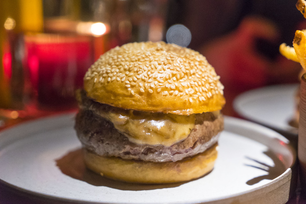
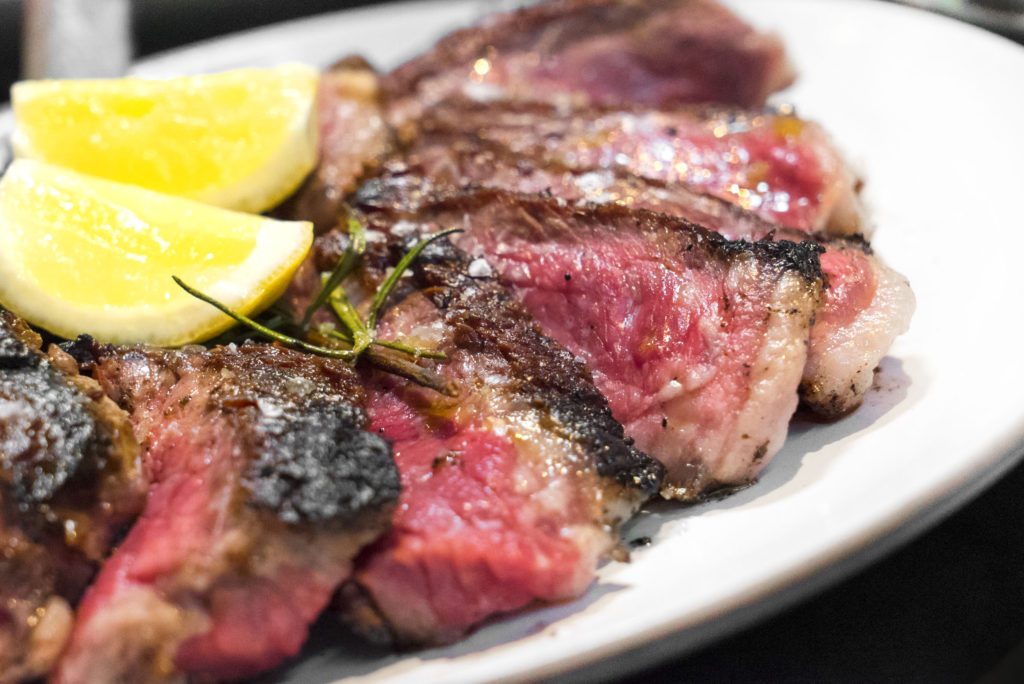
A shot from where your head is positioned as you are sitting there generally isn’t the best view. That’s what everyone else sees and likely what everyone else who isn’t shooting good photos will also shoot. You want to stand out, so do something different. Also: get close sometimes. People like to see the nooks and crannies of food as well as the overall presentation.
Rule of Thirds & The Golden Spiral
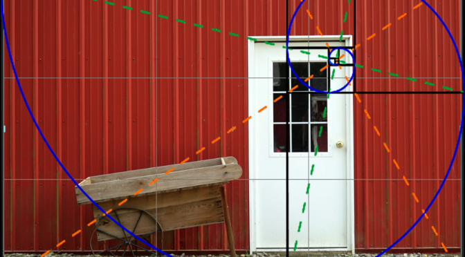
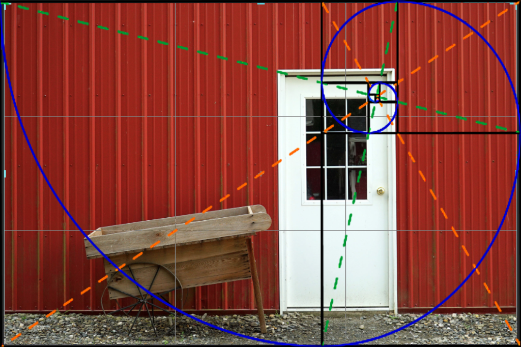
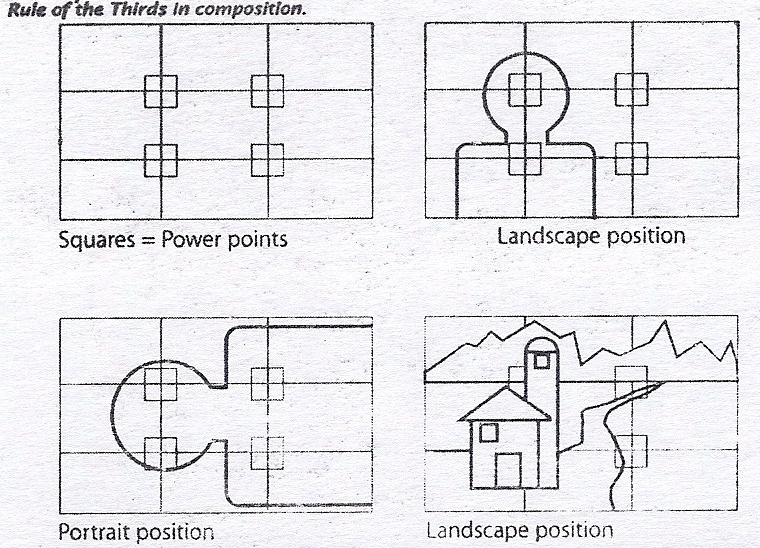
It has been shown that use of a certain amount of negative space in a photo draws the eye to the subject more effectively, and this ends up creating a more appealing and visually dynamic image. The idea here is to frame your subject to take up a certain position within the frame. Most cameras have grid lines that you can superimpose over the viewfinder to guide you for the rule of thirds.
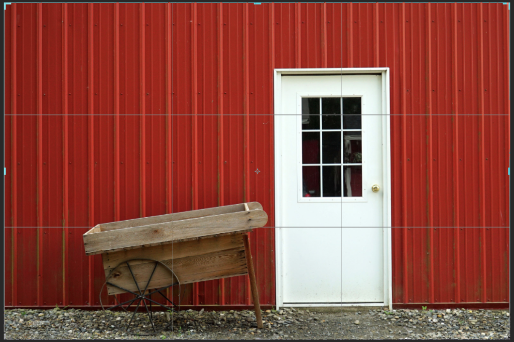
The Golden Spiral is a curved, visual representation of the Fibonacci sequence in mathematics. The termination of the spiral is said to also coincide with a naturally pleasing location for the focal point of the image.
EDITING AT HOME
So you get home, extract all your photos, and realize that they arent what you hoped. Some are dark, or the colors don’t pop. Some are slightly warmer or cooler than you expected, even when following all the parameters set forth above. Don’t fret. It happens. I edit almost every photo, at least a little bit, after I pull them from my camera.
For food, there are a few specific controls that usually elevate the photo a bit more before I am ready to publish. I use Photoshop, but most of these are available universally across all photo editing programs, even on free apps for cell phones. So worst-case you can just transfer the files from your camera to your mobile device. If you see these controls, play around with them to learn what they do and how they make your photo better or worse.
Brightness/Contrast
This is pretty basic. It will make whites whiter and darks darker.
Shadow/Highlight Adjustments
The reverse here, this makes darks lighter and whites darker. Sometimes there is detail in those shadows and highlights that you want to bring out.
Structure/Detail
Similar to sharpness, this will make details and grain or texture stand out better as you add more, but don’t go too far or else it will look like shit.

Further Color/White Balance Adjustments
Sometimes you just need to tweak the color and white balance some more, even after following all the guidelines I outlined above. Warmth or coolness can add mood, and with these editing controls you can even create cool shit like vintage effects as well.
SUMMARY
Taking good photos is NOT easy. That’s why us real photographers get so pissed off when people say some bullshit like this:
“Oh wow! Your camera takes great pictures. What kind of camera are you using? I wish I had a good camera so I could take good pictures.”
Fuck you. As if spending money on a good camera means you will have better a photography portfolio… Nope. It doesn’t work like that. Some of my best photos come from an old camera that I wouldn’t be able to sell for $50 right now on Craigslist.
Photography is a weird mix of art, skill and science. The science parts are the camera optics that are made by genius engineers. Learning how to use the camera properly is like developing and honing any other skill. It takes practice, patience and dedication, like martial arts. And knowing how to achieve the desired image that you have in your mind to convey a mood or feeling to a viewer is where the art aspect comes into play.
As I said above, anyone can take a technically good photo. But not everyone can make it art. Now, I’m not saying that all of my photos are “art.” That would be ridiculous; especially in the world of food photography. Many are just a more appealing documentations of the meal. The real artists in the food photography world, in my opinion, are the ones cooking the food and composing the plates.
Lastly, don’t be dissuaded by this info if it seems daunting. Keep at it. Read it again and again. Eventually the mechanics of camera operation will all sink in and click for you. After that, you’re set.
If you want, feel free to take this handy tip card:
And print this 18% grey card from a black and white printer to hold you over until you get an actual card:

